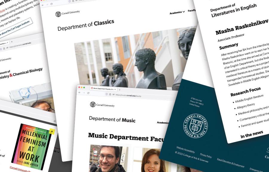
This is a collection of ways to use various components on pages that have wider layouts.
It is critical to be aware of the context of the elements that you place on a page. Some layouts don't work on narrow spaces, and some get washed out at full width. Please follow the examples laid out here for how you can use the elements on landing pages or basic pages where the side bar is hidden.
Photo and text blocks
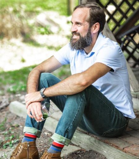
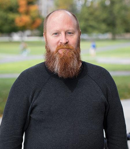
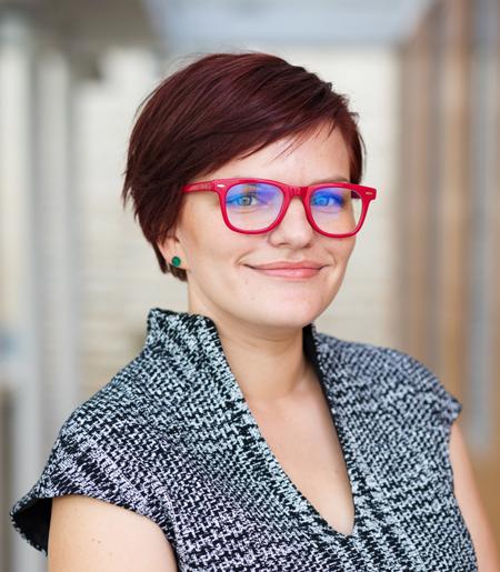
Photo and text blocks are used for featuring content. There are a few options for display. A single item as a spotlight, an alternating stack of items, or as a carousel.
Eyebrow here as hook
This is a heading 2
Only use the eyebrow as a hook or subtitle for the main Heading 2 title for the text block. Eyebrow should only be used here.
Eyebrow here as hook
Another topic (this is Heading 2)
Only use the eyebrow as a hook or subtitle for the main Heading 2 title for the text block. Eyebrow should only be used here.
Eyebrow here as hook
Third fake item
Only use the eyebrow as a hook or subtitle for the main Heading 2 title for the text block. Eyebrow should only be used here.

Eyebrow here as hook
This is a heading 2
Only use the eyebrow as a hook or subtitle for the main Heading 2 title for the text block. Eyebrow should only be used here.

Eyebrow here as hook
Another topic (this is Heading 2)
Only use the eyebrow as a hook or subtitle for the main Heading 2 title for the text block. Eyebrow should only be used here.

Eyebrow here as hook
Third fake item
Only use the eyebrow as a hook or subtitle for the main Heading 2 title for the text block. Eyebrow should only be used here.

