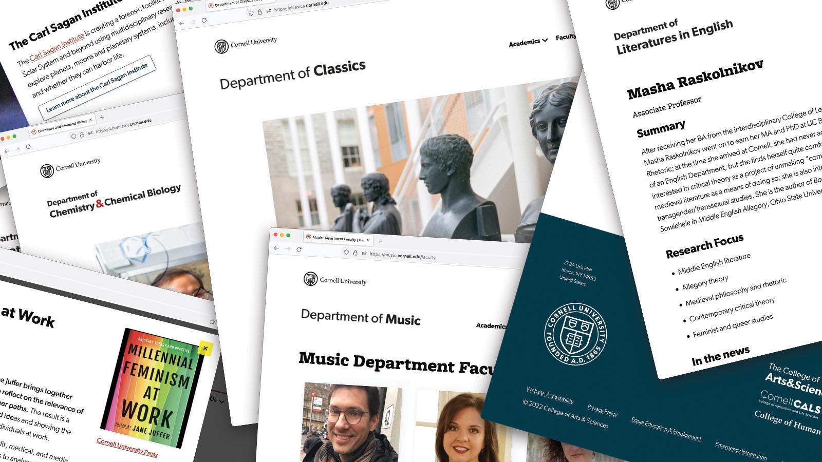
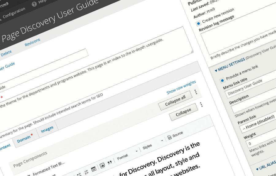
Welcome to the user guide for Discovery. Discovery is the name of our custom Drupal theme that provides all layout, style and editing tools on A&S department and program websites. In these pages you will find the user guide to content management, information on accessibility, and best practices for adding images and formatting text on your websites.
Helpful guides
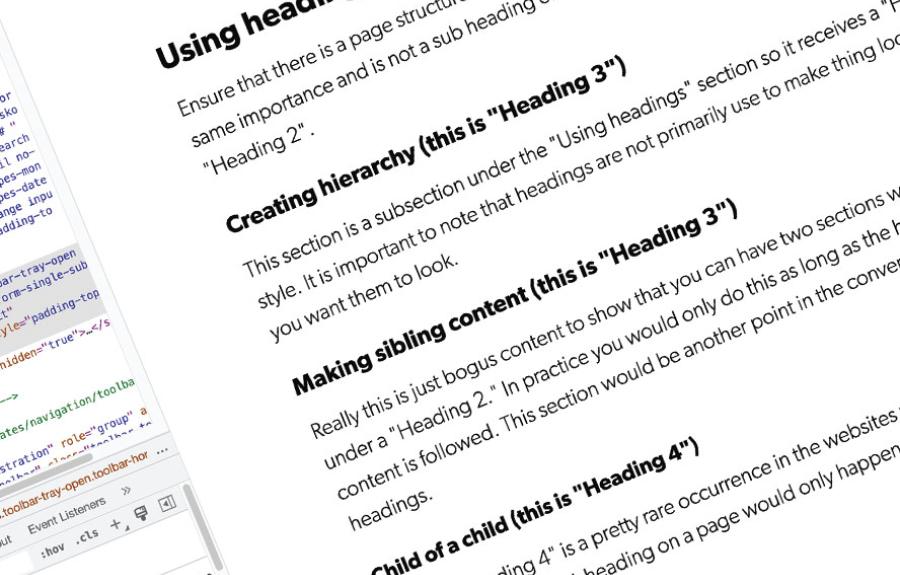
Adding meaning and hierarchy
Headings and text styles, not just for looks
Headings and styles are not just for style, they are critical components of accessible, searchable and meaningful web pages.
Adding color to your pages
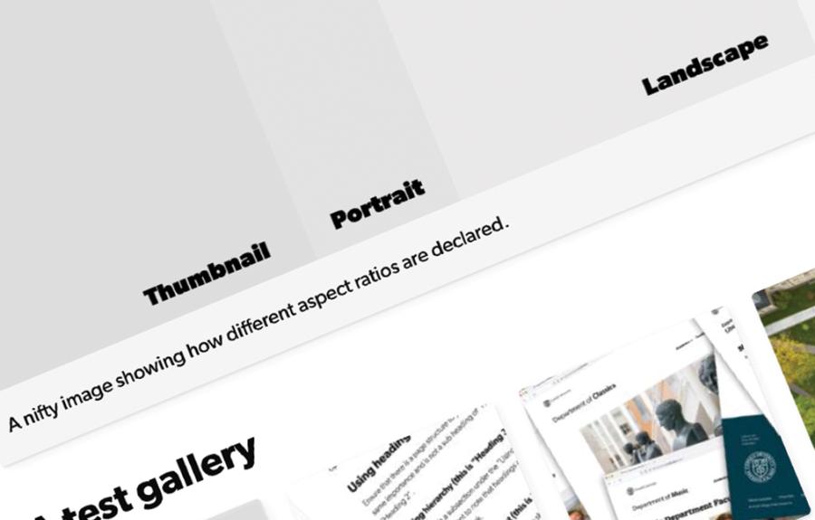
How to use images
Images are used to add to the content of your webpages. There are different shapes and sizes avaialable.
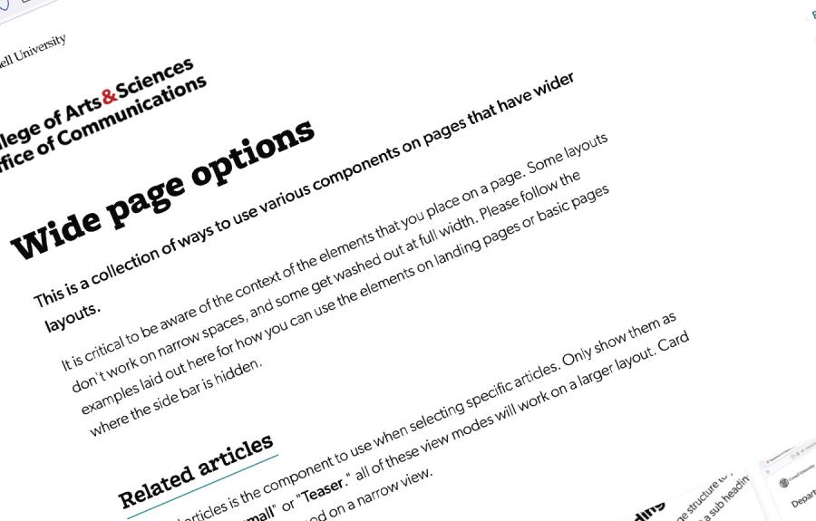
Room to breathe
Component usage on wider layouts
This page has several examples of different components being used on landing pages or basic pages without sidebars.
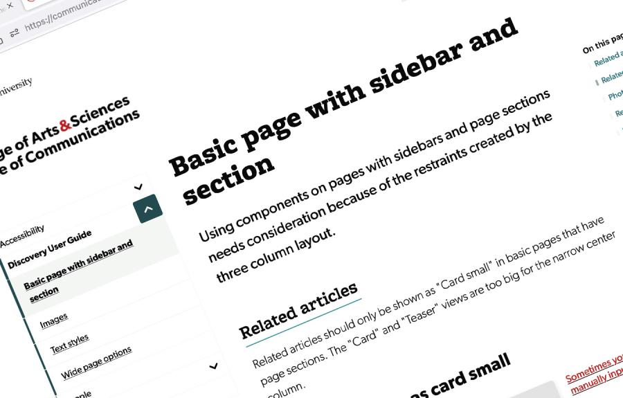
A tighter fit
Be more restrained with the sidebar
When a basic page has a side bar, it is critical to ensure the items selected fit the space. This is especially acute when there is a third column for page section navigation.

