
Drupal navigation
When you are logged in you will see the Drupal editor's navigation bar at the very top of your screen with "Manage", "Shortcuts", and your username, and then light blue buttons below and to the left with "View", "Edit, and "Revisions".

To access the homepage at any time, click the department name next to the university seal.
When you are logged in, all pages that you can edit will have a blue edit button at the top left under the nav bar. Clicking it will take you to the editing view for that specific page. If you need to search for page you want to edit, click on the “Manage” drop-down at the top left and then “Content":
The content browser allows you to find any page or article that exists on your department site. Enter a search term in the "Title" field (it will only search page titles, not the content of page bodies), and then click "Filter" to search. Using the following filters, you can sort your search results:
- title
- type of content
- content author
- publication status

Content types
Content types on your website have been simplified in the new version of Drupal. The following content types are available for you to add/edit, and each comes with a specific set of page components that can be added:
- Landing page: reserved for prominent, "top-level" pages such as the homepage and major destinations in your site menu. Because this content type should be used sparingly and for a very specific purpose, you do not have access to add new landing pages, but can edit existing ones. If you feel you need to add a new landing page, please contact Scott and Bob.
- Basic page: the meat and potatoes of your website. You can create new basic pages as well as edit existing ones. The "modal page" type from the old version of Drupal no longer exists, but that style of page formatting can be recreated using the new basic page type. Check out the section on page components for a more detailed explanation on this.
- Article: As before, you can add your own new articles to your website, while articles written by the college communications office will continue to be tagged for your department/program and automatically exported to your site. The exported articles will show up automatically as they're added both on your homepage news feed as well as in the news archive page.
- Webform:
- Newsletter: Click here for instructions on building newsletters for your site.
- Work: A snapshot of faculty work (books, performances, lectures, etc.) that can be displayed in "profile" format with an image on various pages.
Quick in-page editing
Drupal has an in-page editing tool. Clicking the pencil icons that appear as you scroll down a page (when logged in) will enable you to make quick edits to individual page components, rather than entering the full "edit page" interface. This is useful when you need make a quick edit to a single component, fix a typo, update a deadline, etc.
If you pause your cursor over the pencil icon, it will outline the component text (other other content) you can edit from that point. Simply click the pencil, and then "Edit" to open up an editing window for that specific page component:


If you're having a difficult time locating the pencil icons as you scroll, at the far right of the top Drupal nav bar is a pencil icon next to the word "Edit". Clicking this button activates the "pencil finder" which will temporarily make all pencil icons visible on the page:

Overview of page components
New to the updated version of Drupal are page components. All pages on updated sites are comprised of page components. When you edit an existing page, you will now see a list of the existing page components on the edit screen. Existing components can be re-arranged by clicking and dragging. Components can also be deleted by clicking the three dots to the right and then selecting "Delete", but be forewarned that this a permanent delete function and the content will not be recovered if you save the page after deleting.
Like with any other content updates, you must always click the "Save" button at the bottom of the page editing screen after rearranging, deleting or adding new components.

When editing a component, it will expand to show editing options and fields specific to that component type. To minimize the component and return to a "cleaner" layout after making changes, you can either click the "Collapse" button to the right of the component, or, if you're finished with all edits on the page, you can simply click the "Save" button at the bottom which will close the editing interface. If you have multiple components open for editing at the same time, you click "Collapse All" to minimize them simultaneously.

Remember that "Collapsing" a component does not save your changes. You must always click "Save" at the bottom of the page edit screen to save your changes. You can update and collapse multiple components before saving, but you must still save before leaving the page edit screen.
The next section explains the different components that are available to use.
Component types
The list of page components available to you varies depending on which page type you're editing (Article, Basic Page, Landing Page, or Newsletter). You can always view the available components by editing a page/article and clicking the drop-down components list underneath the existing page content:

Event Blocks:
Event blocks can be added to basic pages or landing pages only. When you add a new events block to a page, there are only three fields you need to fill out:

"Component Label" gives you a text header above the events feed, which can be anything you want, like "Upcoming History Events" or "Featured Humanities Events." It's just a simple text field. "Events Shown" allows you to customize the number of events that display. The default is 3, but you can customize this based on how many events you have tagged in the university calendar. Localist Tag is where you will enter the tag you use in the university calendar/Localist when adding new events. You can only use one tag per events block, but if you have multiple tags for different categories of events, you can always add additional events block components to a page to showcase the different tags.

Formatted Text Blocks:
Formatted Text Blocks (FTBs) are the meat and potatoes of your site, and replace the "Body" field you may recall from your old website. FTBs can be used in almost all page types, wherever you want to have text with (or without) embedded links, images, etc. Whenever you add the FTB page component, you'll simply see the familiar Drupal text editor appear. Like with any other page component, you can add multiple FTBs to a page if you want to space out sections of text amongst other components (news, events, etc.)

Link Blocks
The Link Block component allows you to insert a section of links (styled as buttons) on most page types.
When you add a new Link Block, you'll see a field called "Link Block label". This field is not required, but allows you to customize a text header that appears above the link buttons (i.e."Important Links for Majors" or "Faculty Research Websites"). For each link, you'll just need to add a URL and link text. If the URL is something internal on your website, you don't need to type an actual URL, and can just start typing the name of a page, article or faculty profile. When the full title of the page/profile/article you want to link to appears, just click it. External links (pages outside of your website) do require an actual URL (including http://). You can keep adding additional links (if desired) but clicking the gray, "Add another item" button below each link.


List Blocks:
The List Block component replaced the automated news feed from your old site. This displays a subset of the most recent news stories that were added to your website (either by you, or imported from the A&S website). The order of this feed cannot be customized/changed: it will always display the most recent stories.
You have two options to customize the look of this feed: you can select either the "Carousel" style, which gives you a scroll-able "gallery" of news stories with landscape images and visible 'teaser' summaries, or "none" on the Carousel field, which gives you 4 stationary cards. Examples of those two display options:
Carousel:

No Carousel:

The two display options for list blocks use different image styles, as you can see above. The Carousel option uses landscape images, while the "no carousel" option uses portrait images. You can decide which look you like better. If you want to use Carousel, be sure to select it in the field labeled "Carousel., and set the "Display Id" field to "6 teasers":

To switch to the non-carousel format, change the DisplayID field to "4 cards" and change the "carousel" field to "None":

Related Articles
The Related Articles components enables you to manually select specific articles that you want to embed as a news feed on a page. Unlike the "List Block" component described above which is an automated feed of recent articles, the Related Articles component only includes articles that you manually select, and those selections will stay there in static fashion until you change them out or remove. The "carousel" layout is not available for Related Articles; they can only be displayed as cards.
A quick recap:
List Block = automated feed of recent articles, carousel or card view available
Related Articles = static feed of handpicked articles, only card view available
When you add a new Related Article component, you'll see an optional "Component Label" text field. Just like with other component types, this enables you to customize the header that appears above the article feed (i.e. "Student Stories" or "Recent Faculty News".) You'll then see fields to add your article selections. Start typing the name of an existing article headline, and when the full text appears, click it to select it.
The gray "Add Another Item" button enables you to add additional articles to your feed. Just like with other component types, you can add multiple "Related Article" feeds to any page and click and drag to rearrange them among the other components.
On landing pages, you can use the "Card" view mode which will give you larger preview cards for the articles in rows of 2. On basic pages, you should change this to the "Card small" mode, so that the smaller preview cards take up less room on the basic page layout.


Page Sections
The page section components recreates the "modal page" layout from the older version of Drupal with an "On this Page" menu of internal links that enable users to quickly jump to particular sections of a single page. This menu now appears on the right-hand side of a page in Drupal 9, as the site-wide menu remains on the left side.

Page sections should only be used on basic pages, and not on any other page type. When you add a new page section component to a page you're working on, you'll first see the "Section Label" field. This will produce the header text at the top of the page section, as well as the title of the link in the "On this Page" section on the right side.

After labeling your page section, you'll need to add components to your sections. If you're just wanting to add text, select "Formatted Text Block" from the list of "Section Components." Keep in mind that "Section Components" are specific to the page section you're creating/editing, and are different from the overall "Page Components" that already exist on the page.
If you want to keep adding new sections like you would on a modal page on the old Drupal, you can keep adding new Page Sections from the "Page Components" drop-down, making sure you add a separate text block for each. The equivalent of a "modal page" on the new site will end up looking like this on the editing screen:

You You can include other component types on a page with page sections, but keep in mind that those will not appear as an "On This Page" link unless they're a compnent within a page section.
Related People
This component is very similar to the "Related Articles", but instead allows you to embed cards for any faculty/staff/grad students who have profiles on your sites within a basic page, landing page or article. The functionality is exactly the same as with Related Articles. First enter a label (if you wish) to provide a text header for the grouping of people (i.e. "Faculty Honors Advisers" or "Featured Grad Students". And then in the "People" text fields, start typing the names of faculty/staff/grad students whose profiles already exist on your site. When the full name appears, click it to make your selection. The gray "Add Another Item" button, like in other component types, enables you to add more people to this grouping:
If you have recently created new profiles for faculty or grad students on the "People Site", they need to be added manually to a page using the process described above. They will not be findable/selectable in a "Related People" block until you have created and saved their profile on the People Site first.


Photo and Text Blocks
This component is only available on landing pages; you won't see it in the list of available components on basic pages or articles. Like on your old site, this component enables you to align short block of text with a landscape image to feature or "spotlight" something on a landing page.
When you add a new Photo-and-Text Block component, you'll first see a field for the "block label." This field is optional, and should only be used if you're going to include multiple photo-text blocks in this area and want them unified under a single header.

This example of photo-and-text blocks on a page does not have a block label:

This example uses the block label field ("Academic Opportunities"):

After choosing whether you want to have a label (for multiple blocks) or not, you'll enter your text in the "text block" field. You can then select the image you want to align with this text block in the "Image" field by clicking the "Choose Image" button. This opens up the same image library/selection tool used in all other parts of your website. Follow the same instructions from the Image Selection section of this guide. Keep in mind that the Landscape style is the only image style available for photo text blocks. You'll see only that style available from the existing library here. If you add a new image, you'll still be required to crop all four styles, but only the landscape style will be added to the phototext block.

If you want to include multiple phototext blocks together, click the gray "Add Photo and Text Items" button after entering the text and image for your first one.

The "Spotlight" option you'll see below the Image field is a design option if you have only one PhotoText block that you want to "feature." This is what the Spotlight style looks like:

The Spotlight style should only be applied sparingly, usually on the homepage only, when there's a single phototext block that you want to call attention to. Do not use the Spotlight option for multiple PhotoText blocks grouped together. To activate the Spotlight design, change the selection in that field from "None" to "Spotlight":

Removing extra styles from copied and pasted text
When typing into the text editor on our websites, the fonts and style are automatically set for you by our templates, but if you copy and paste text from emails, other websites or Word/PDF documents into your website text editor, you must remove extraneous formatting. Copying from those external sources can (and often does) include extra HTML code that alters our standard web fonts and styles that are established in the page templates on our websites.
It's often difficult to tell that these extra styles have been included in your pasted text until you save and publish, so make sure you take the seps outlined in the guide below, every time you copy and paste into a website text block.
Click the arrows to advance the slides in the guide. If you have difficulty viewing any details on the slides within this page, click the vertical dots below the player and select "enter fullscreen."
Headings and tables and quotes
If you are frequently adding or editing text on your website that contains headings, special classes (i.e. "Notice"), block-quotes or tables, be sure to review our best practices and guidelines for these situations.
Images
We have created new, detailed guides on how to select, prepare, and add images to your department or program website.
Embedding videos
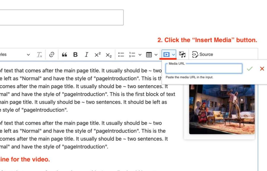
1. Make a line for your video, place the cursor then click on the “Insert Media” button.
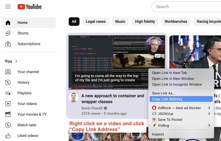
2. Copy the video URL from YouTube or Vimeo.
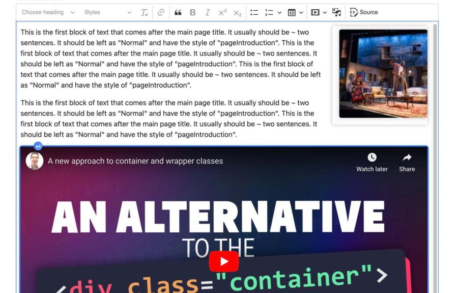
3. Paste the url into the field

4. Video is displayed full width: you no longer need to select the “Video Container” Style. Just save the page.
Adding image galleries
Menus and site navigation
In the new version of Drupal, there are two menus visible to users on your site. The "Top Menu" includes the navigation tabs in bold and corresponding drop-down links that run horizontally across the top right of your site (underneath the college logo).

The top menu is not meant to be a complete inventory or site map of all pages on your site. Instead, it's intended to provide a snapshot of the most important/popular destinations on your site. For this reason, access to modify the top menu is restricted. If you feel you need a change to the top menu or the drop-down links, please contact Scott.
The other menu visible on your site is new in the updated version of Drupal, and is referred to as the "Main Menu." The main menu appears in the left sidebar of all basic pages on the site:

Unlike the Top Menu, the Main Menu is meant to be a complete map of all pages on your site. This menu will aid users in finding their way around the site and not getting "lost" in deeper-level pages.You have access to add new pages to the main menu while editing a page, and can also change the "Parent" of a particular page in the menu. If you need assistance with more detailed rearrangement of links in the main menu, please contact Scott.
To change "Parent" of an existing page in the link, open the page editing interface and look for "Menu Settings" on the right hand side of the editing window:

The "Menu Link Title" field will change how the link for that page appears in the Main Menu (but it does not change the title of the page itself). You can choose a new "Parent" in the menu for that page by selecting from the "Parent link" drop-down.
If you are creating a new a basic page, you must first check the box for "Provide a menu link" before you can set the parent and menu link title. Remember that all basic pages on your site should be in the main menu.
Example pages and layouts
The following links contain examples of standard page layouts you may encounter (or create) on your website. Each contains illustrations of how various components and content types can be implemented successfully to make your content more impactful and easier to navigate.